Developer Blog #2 - UI Design Process

Hi backers,
This is Matt. We're back this month with another developer blog. Hope you enjoy.
Also mark June 1st on your calendars. The upcoming Kickstarter update is going to be very different from the last couple. I'm super excited to share the first set of production art!
Thanks, Matt
05/15/2018
Hey backers,
This is Rowan Ryder again from Torus Games, here with Tyson Hollitt, who’s in charge of the User Interface design for Unsung Story. Today, we’re going to talk about UI design; where it’s currently at, how we got there and how we plan to proceed.
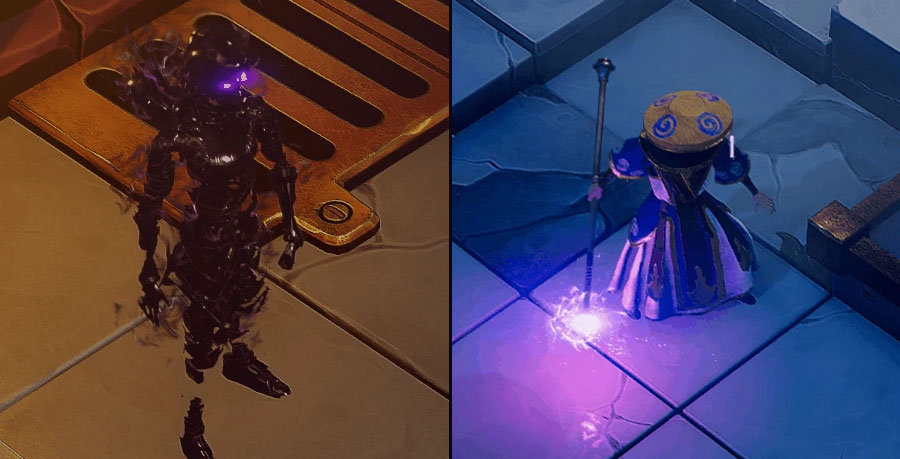
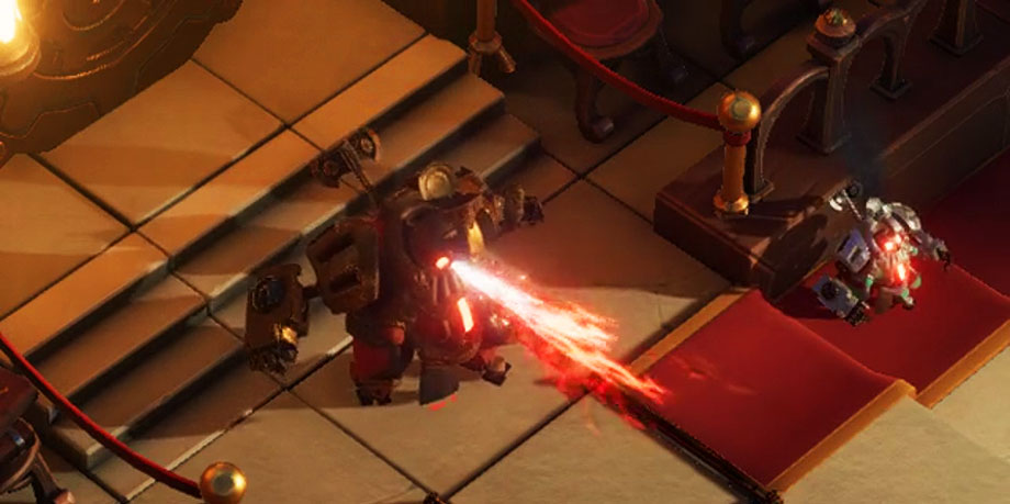
As always, please note that the visuals here are completely placeholder and do not reflect the final art of the game.

This means that the final game probably won’t have these adorable robots.
UI Pre-Production
At the beginning of any project, it’s important for the UI Designer to collect reference material; trends from games in the same or similar genres, trends from the industry at large and even examples of UI from software outside of games. We look at what’s working and what isn’t, then combine that knowledge with what we understand to be unique about our game.
In this case, we need to break down and understand what players expect from the UI; each units vital stats, their equipment, the turn order, where each unit can move, etc. It’s also important to lean on what the player already understands — players are constantly learning while they play a game (any game), and it’s important that the interface doesn’t ignore this fact.
Finally, pre-production involves listing out what information will need to be exposed to the player through the interface. It’s extremely helpful for the dev team to have access to this information in an easily digestible form so we don’t overlook anything as we move forward.
It’s very common for developers take information for granted when they live and breathe a game for months, but as soon as a new player gets their hands on the game they’ll find it bafflingly vague and obscure. As such, we rely on an itemized list of information to make sure we’re on track (as well as regular play testing!).
Unsung Challenges
All projects bring unique challenges to the table, but the most impactful one while developing Unsung Story has been the unusual grid shape (and how we display it to the player).

Display methods for the triangle grid
We’re aiming to make it look and feel organic, but still intuitive and easy to read and understand. It may sound simple on paper, but as each edge case arises it becomes more and more complex — verticality, attacks that allow you to move in unusual ways and so on all considerably complicate the design.
On a slightly different note, the turn queue has been an interesting technical challenge. Figuring out which unit comes next is relatively easy (without spoiling too much, we’re using a Speed system not too too dissimilar from Final Fantasy Tactics). The problem comes from abilities that delay or speed up units and how we can display that in real-time. It’s coming along smoothly, but it won’t be surprising to find ourselves polishing it right up until the end of development.

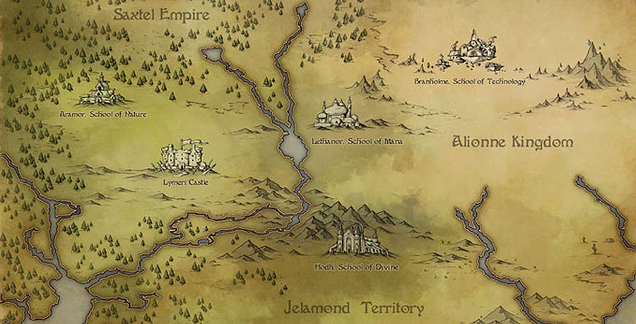
Mockup of World Timeline Map
Note that the actual map behind the UI is a holdover from PlayDek’s work — our World Map is still in development, and there’s a lot about the map we’re not quite ready to share. Similarly, we’ve changed the real mission names to miscellaneous references (no spoilers!).
Influences
Getting this right out of the way — Final Fantasy Tactics is a core influence of all facets of development. We want the UI to feel indicative of FFT, but we also need to ensure we avoid some of the issues it had (which weren’t exactly uncommon in the 90s).
This essentially means that we want to avoid the player taking several steps to perform a simple action; we don’t want to remove any strategic depth, but we do want to make sure players spend more time fighting enemies than they do fighting the UI.
As such, FFT: A2 and Tactics Ogre: Let Us Cling Together have been stronger influences in terms of flow and usability. Monster Hunter World has been another big influence, given the huge amount of stats and other information it manages to display (relatively) smoothly.
Finally, yes, the XCOM games were a big influence, particularly on the grid. Our grid has significant differences and is generally more strict about unit movement, but we liked a lot of what XCOM did, particularly in regards to the grid outline. However, XCOM also majorly influenced other areas, such as attack confirmation.
Building the UI
Each part of the UI is built in a different way, depending on the problem we’re trying to solve. Typically, though, the first step in all cases is to work out all of the information being displayed and what interaction is available within any individual screen.
Then, this needs to be cross-referenced with every other screen to see if context changes anything. For example, the Equipment Screen for a unit will change if you’ve come it directly from your Inventory Screen by selecting something you wish to equip. This means that all screens have to be made with consideration to the others, so it can take a long time to finalise their layouts!
Then, the programming team needs to get involved to make sure we’re not doing anything too outrageous (just stuff that’s the right amount of outrageous). At this point we’ll typically have a decent paper sketch of the screen (and several sketches that that are much rougher), so we can talk the team through the plan.

Iterations of rendering full ranges for the Triange Grid
Next, we make a “wireframe” of the screen. This differs from project-to-project; sometimes the wireframe is done in specific prototyping software, sometimes it’s done in graphic design software (which is how we’ve been handling it) and other times it’s actually done directly in-engine.
Once this is done, a programmer hooks it up and we can test it (complete with basic animations). This is when we can iron out the problems we didn’t anticipate, though unless the UI is extremely complex (such as with the turn queue), there typically aren’t many.
Finally, we add art! There can be small tweaks to the screens from here, but (unless we run into some kind of major issue or game-wide overhaul) we rarely change much.
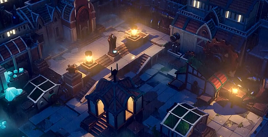
Unsung Story — like basically all RPGs — has a lot of complicated UI, so there’s still a lot to be done. We’re getting through it at a good pace, though, and look forward to showing you more as we move forward.
As always, thanks so much for your support!
We’re looking forward to the rest of the journey.
LATEST NEWS POSTS
Steam page, new Early Access trailer, and PC Steam keys!
Dec 14, 2020 | PC
Chapter 1 Alpha Available Now
Sep 18, 2020 | PC
September 2020 Update - Chapter 1 Alpha roll out
Sep 1, 2020 | PC
August 2020 Update
Aug 1, 2020 | PC
July 2020 Update
Jul 1, 2020 | PC
June 2020 Update
Jun 1, 2020 | PC
First Playable Livestream on June 1st
May 15, 2020 | PC
May 2020 Update
May 1, 2020 | PC
April 2020 Update
Apr 1, 2020 | PC
March 2020 Update
Mar 1, 2020 | PC